Debtor to Investor.com
Web app, 2021
WHAT: A web app that charts a prioritized path to move from paying interest to earning interest.
HOW: I built this as a project to learn React. It’s got a Rails backend and a SQLite database.
WHY: After much research, I realized there’s a generally agreed-upon set of best practices in personal finance. I wanted to make an easy-to-use app that gives the user a set of steps that’s personalized to them based on their answers to a few questions.
WHO: For anyone in debt who’s feeling overwhelmed and doesn’t know where to start to get their finances in order.
Development
Concept
No one actually wants to read a personal finance self-help book. Even if you do, you have to slog through all the stuff that doesn’t apply to you. For that reason, I thought a “Choose Your Own Adventure” format would work really well.
Brain Dump
With the general goal in mind, I like to do a brain dump into an infinite-bullet app called Workflowy.
User Stories
In my Workflowy outlines, I listed a series of simple user stories that I could refer back to throughout development to make sure I was on track.
Quick n’ Dirty Wireframes
Once I have my goals written out, I like to start wireframing in Balsamiq. The interface is starting to take shape.
Logic
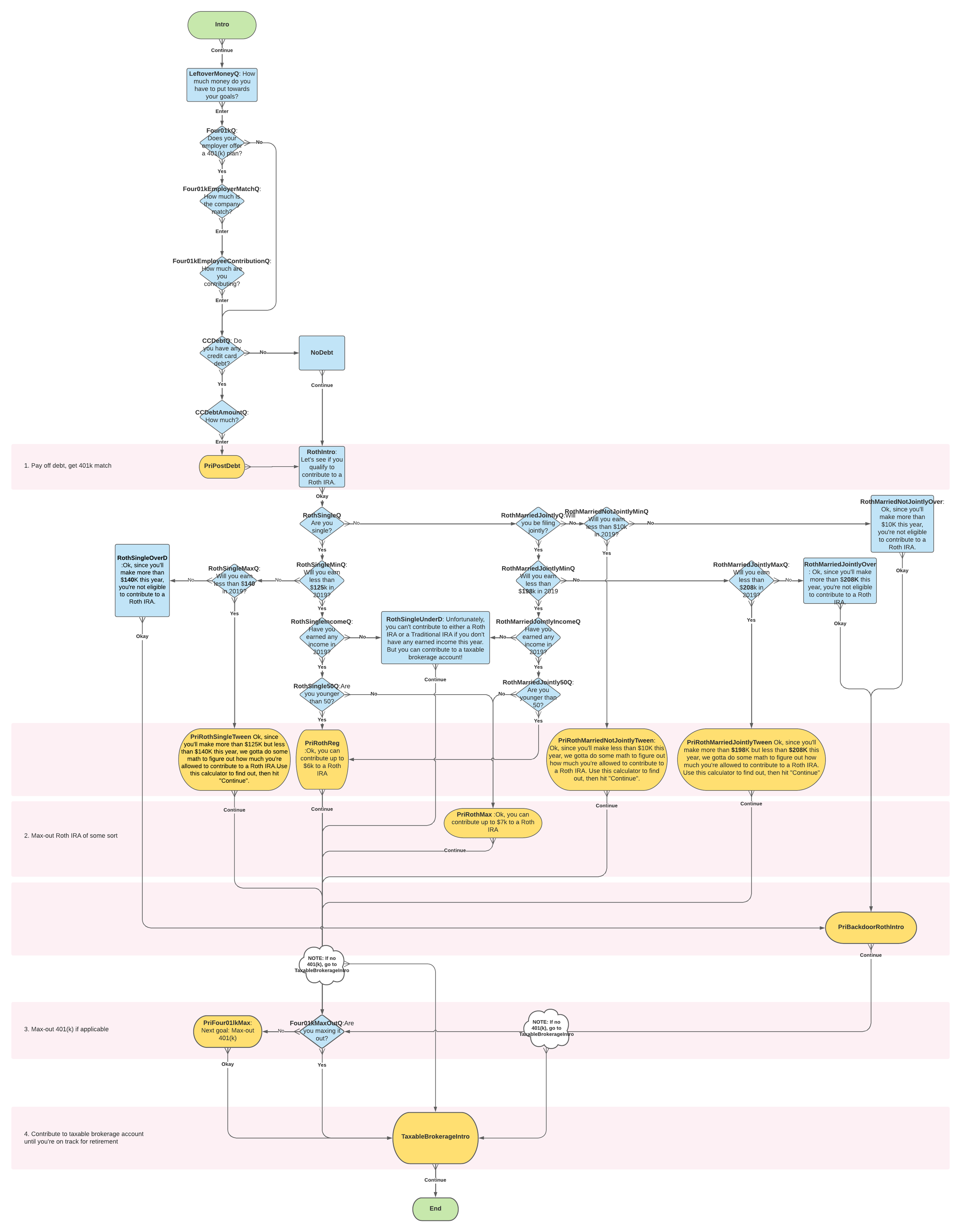
The most challenging aspect of building this app was ensuring the logic flow was correct.
Debt vs 401(k) Matrix
The biggest variables were the debt amount and the 401(k) contribution amount. Based on these two factors, there are 12 different outcomes in this admittedly-ugly-yet-usefully-color-coded matrix.
Flowchart
I created and re-created a logic flowhart in Lucidchart four times until I got it right.
Components Components Components
I ended up creating 36 different screens for different paths the user might take. This required some fairly ridiculous naming conventions. For Roth IRAs alone, I had 15 different scenarios.
Testing
Actually, upon second thought, testing was the most difficult part of this project. The user could take ten different possible routes through the app, so the best way I could think to manage this was to diagram out each path and document what happened. This was grueling!
Branding
I love to coming up with a brand and logo. That’s kind of my favorite part of development, though it’s far less important than the actual product. I started with a notion of growing from “minus to plus” and futzed around until I got something that looked right. I created the blue sky illustration as the background for the app to convey an sense of hope and possibility.
Rough sketches of the logo
Final version of the logo
Visit DebtorToInvestor.com
Read more about the thinking behind DebtorToInvestor in the following post I wrote for The Mission.org on Medium:


